

Problem Statment
CloudBees Product Navigation
Product Design • UI/UX • Design System
Problem Statment
CloudBees Product Navigation
Product Design • UI/UX • Design System
Problem Statement
Uniform product experience.
CloudBees provides enterprise DevOps solutions by enabling developers with tools to deliver quality software while also providing management with equally powerful tools. The variety of products inherited diverse navigational structures which lowered user satisfaction.
New products and features were being released at a quickened pace and CloudBees needed a plan for uniform product experience. The first step was navigation across the number of user interfaces.

Challenges
Challenges
Challenges
Multiple navs, multiple needs.
Many of the CloudBees products were built by different people and had different navigational features and functionalities. Some were purchased by CloudBees and had their own established structures.
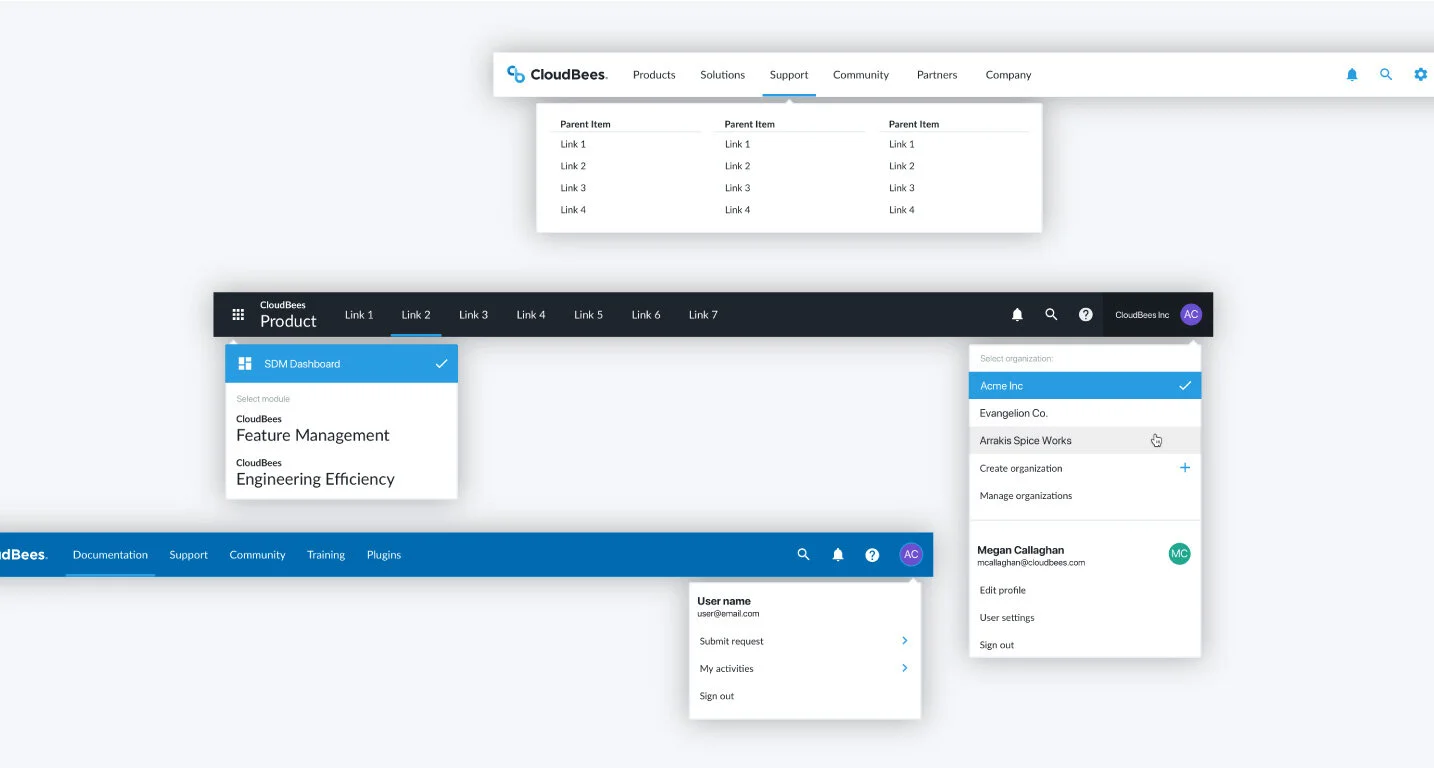
In discovering a universal structure, we went through enough iterations and established feature priorities so that no functionalities were sacrificed. Each product, documentation, or marketing navigation is a variant of the core style. WIthin product, there are even a few more variants that still maintain uniformity, so we were able to find a “win” from all angles.

Solutions
Solutions
Solutions
Nav positions and switching between products.
CloudBees users are presented with the ability to switch between products. However, jumping from one product to another and having the entire navigational layout and functionality change on you is jarring; users were thinking they’d accidentally left the site.
With navigation variants such as top, side right, side left, and stacked navbars, we needed to make sure nothing was sacrificed or lost within our products. We worked with each product to fully understand the current nav, the needs not met, and improvements we could make. We also took this opportunity to align marketing and product styles.

Results
Results
Results
Increase in user satisfaction, decrease in usability issues.
The introduction of unified navigation across products helped to establish a design system as well as cross-communication between products and engineering teams. We have achieved uniformity while also satisfying product-specific needs via nav variants. CloudBees products and entities have seen success in the following ways:
👉 Unified navigation adopted by 80% of CloudBees products to date
👉 Increase in user navigation by 65%
👉 Increase in registered users by 4x
👉 Decrease in responsive and mobile usability issues