

Building A Brand
Creating a personal brand is one of the most difficult tasks to undertake — any designer can tell you why. It can be too tempting to resist combining everything we like when what we really need is to instead refine our visual identities down to our essences. As a brand designer myself, I've wrestled with all the temptations and frustrations of any client's work, along with a chorus of personal anxieties. It wasn’t until I removed myself from the process that I was able to distill and translate into a clear style my fundamental qualities.
But, how can removing yourself from self-branding be the solution? How can detaching personal preferences for a personal brand result in a more accurate identity? For me, it’s best described through my latest journey.
Fig. 1 – Self Portrait, charcoal and conte on paper, 2010
The Inception of Method & Medium
While attending a portraiture painting course and a web design course back-to-back in college, I was assigned two projects that would inevitably send me on a long, arduous trek to Method & Medium: a self-portrait and a personal website.
I loved portraiture, but admittedly, self-portraits were not my strength. I struggled to view myself from an outside, neutral perspective. I had a difficult time capturing my own likeness. (As you can see in Fig. 1, my first attempt looks rather like a mugshot.)
Meanwhile, I was also tasked with creating a portfolio website. I needed to figure out how to present my assorted works, which was insufferable when I couldn't accurately present my own face on a piece of paper. Like many artists, I dove in head first and without a plan.
Fig. 2 – The First Logo Attempt
As the structure of my website began to take shape, I resolved my dissonance by internally separating fine arts from digital design. I made my first logo with that division in place. Though "logo" is a generous word for what it was. I made a default word-mark and I don’t think I even altered the font.
My colors were a dingy grey, a tan resembling that of a ceiling water leak, and a stray teal. (Fig. 2) It had no rhyme or reason and I didn’t even like most of the colors. The palette was awful. My work was — as to be expected from a young college student — untamed and inexperienced. It was all over the place; I was still figuring out my strengths. (And weaknesses).
Fig. 3 – The First Logo Revision
Reworking and Revisiting
Months later, I visited my website to add new work. After having pulled it up for about .05 seconds, I realized this did not represent me, my work, or my personality in any way.
I downsized hard and reduced my color palette to black and white, kept a similar logotype, and let the work stand alone. (Fig. 3) Basically, I stripped my website of anything reminiscent of individuality.
As I was altering the site, I came across my self-portrait. After spending a few moments in silence and suffocating dread of the endless artist's battle to both find and capture one's self – I recognized what should have been an obvious truth. I didn't know my motivation. I couldn't translate myself or my work to anyone if I didn't know why I loved art.
So, I started asking questions and became conscious of how fine arts and digital design harmonize in my personal life. I didn't do one without the other. They were hugely impactful in my character and that harmony was missing from my portfolio (and portrait). As I thought about it, my motivation had nothing to do with struggling to translate inner thoughts and feelings for myself; I wanted to design for others who didn't know how to communicate to their audiences. My truest self-portrait would be the function of my work.
Fig. 4 – Horrifying Third Logo Attempt
Striking A Balance
A few months later, I reached a critical point in my career where I could shift from canvas to screen more easily. It was as if something clicked and I saw the harmonization clearly.
After graduation a few years later (and the crushing, existential dread of unemployment and professional isolation), I started from scratch on my website. I created a new logo which included an “abstracted digital paint drop”. (Fig. 4) I had focused my career on graphic design so the digital aspect was important to me. This icon was intended to represent both fine and digital arts.
Frankly, this is by far one of the more painful things I have ever brought into existence. My palette went from too little to too much and my logo became a distraction. It was a terrible mark, but at least I made my mistakes as fast as possible...? 🤷♀️
Fig. 5 – Fourth Logo Design
New Job, More Opportunity
Thankfully, someone hired me and my personal logo went into hiding. My new colleagues and connections inspired a monumental change in my identity — not just as a designer, but as an artist. While I had been chasing a paycheck, my painting took a backseat. The temporary loss of these integral pieces of me was devastating. Fortunately for my ego, some of my coworkers made sure to highlight my fine arts background when introducing me to others – even sharing my work.
This social element was something I hadn’t considered before. It was amazing to me that people knew me for graphic design, but remembered me for calligraphy and painting.
It confirmed how intertwined the mediums are for me. They are my real self-portrait and it needed to be in my brand. So, I took yet another stab at it. I simplified my mark from a busy, multi-colored shape to a single-color, line mark. I introduced textures and imagery to my brand and it suddenly became versatile in a way that it had never been. (Fig. 5).
The feedback was positive. I had definitely stepped it up.
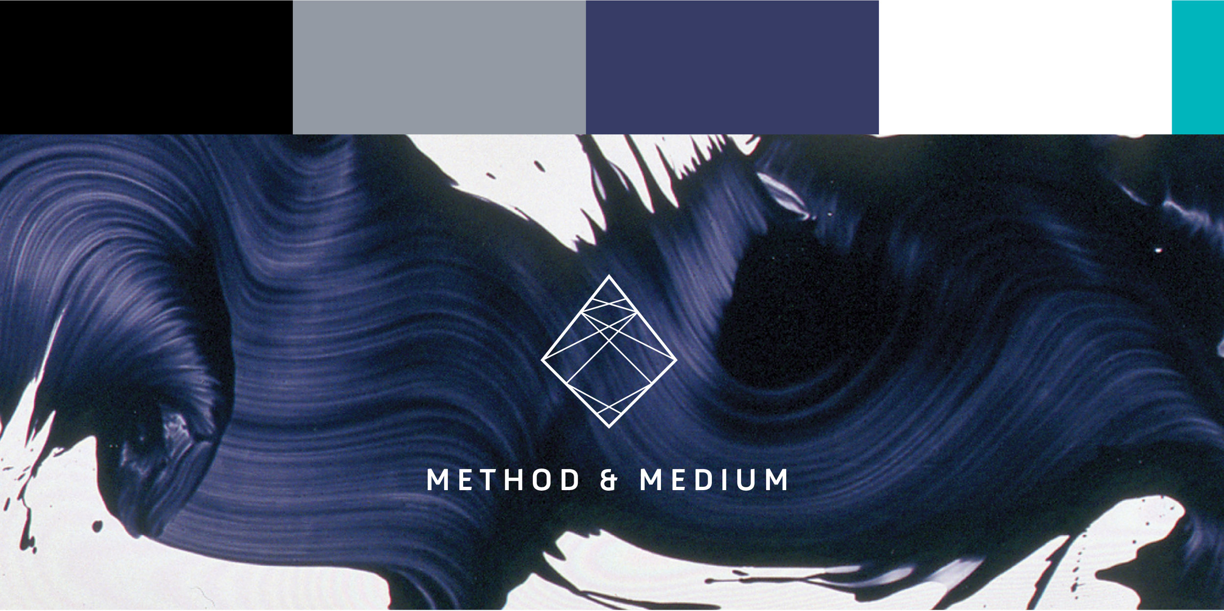
Fig. 6 – Fifth Logo Design
Full-Time Job to Freelance
As I was continuing to grow as a designer and working full-time, my personal brand faded back and forth into existence as real-life problems monopolized my attention.
When I decided to return to full-time freelance work and pursue the work that makes me happy, I knew my brand could no longer be neglected. My livelihood and self-respect depended on getting this right.
I filed for an LLC, formed a plan, hammered down a creative direction, and treated the project as if it were for someone else. I asked myself the same questions I ask all my clients. I reviewed my answers with a systematic and unbiased process.
I have a lifetime of experience in composition, color theory, texture, and conveying emotion through imagery – all infused into my fingertips. To neglect or separate this from my work as a graphic designer would’ve been inauthentic. All the mediums I have explored are of equal importance to the methods I use in design.
I incorporated painterly elements and paired clean essentials with the organic movement of paint strokes. My color palette regained a bright accent as an homage to my past attempts and my journey. Suddenly, I had something that reflected me.
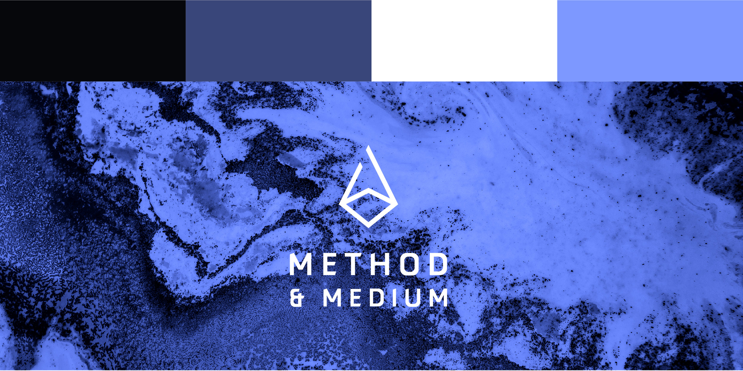
Fig. 6 – Final logo for Method & Medium
Every Method & Medium
As the last piece in a very busy puzzle, I revised a more versatile logo which would resize nicely across platforms. My palette became a bit bolder and I created new paint textures to give myself a variety of imagery.
I wanted to retain the original integrity and purpose of my mark. The bizarre, angular, crystal shape symbolized my rewarding career voyage. But, its meaning was lost on everyone except me, so I hid it in something more relevant to my audience. The logo can now act as a cursor, a palette knife, a paintbrush, a calligrapher's pen nib, and a drop of paint. It represents every method and medium of my visual language: the language with which I interpret the world.


If there’s one thought you take away from either my professional recommendation or my personal journey, it’s that design needs meaning. Design in its definition is purpose, planning, and intent. Recognizing the purpose will always remain step one. The planning and illustration of meaning and intent… well, that's what you have designers for.